Talk:Beacon Locations
Region names / Representation
Hi, I'm a new contributor, so hadn't even noticed this before, but some regions have variations on their names (e.g. we've already got beacons listed for both "Southeastern Shores" and "The Southeast Shores"). This is correct as per the information in-game, but pretty messy. May I suggest we follow the region names given in the locations category for consistency? --MillicentOak (talk) 14:34, 26 February 2016 (UTC)
- Thanks for your datacollection! When I started gathering infos about beacons, I extended the initially made Region-based categorization. But after seeing the sheer amount of pictures, I wonder if there is some better representation of that data possible, like putting all data into a single picture. I just made an inquiry about that on Template_talk:MapLocations -- Gaddhi (talk) 09:31, 28 February 2016 (UTC)
- So what do you guys think is a good representation of the beacons? I think one big map would be the best. The issue here is, how should the single locations represent the different beacons that spawn there? I came up with different approaches, tell me what you think or if you have a better idea
- make the color of the location the color of the highest beacon-color and show all possible colors in a tooltip of the
- make one map for each beacon color (so one map shows all white beacons, the next show all green beacons etc.)
- If you have a good idea how to visualize multiple colors in one marker, let me know and I see if I can implement this in the map-template.--Cadaeib (talk) 12:25, 28 February 2016 (UTC)
- So what do you guys think is a good representation of the beacons? I think one big map would be the best. The issue here is, how should the single locations represent the different beacons that spawn there? I came up with different approaches, tell me what you think or if you have a better idea
- I was thinking the exact same thing! When I was thinking about it yesterday, I thought that the two concentric rings (I didn't actually know that was already implemented!) would look neater, but having now seen the two possibilities, I don't think it conveys the information quite as clearly as the pie chart. I was wondering, is it possible to have a separate map for each region? That way it would be easier to see exactly where the beacons are on the map. There could be one large map at the top of the page still, perhaps with each beacon's max colour, or the max & min idea, and then sections for each region with a more detailed view.
- Another thought I had was it might be useful to grey-out any inaccessible beacons, so that people know "Hey, don't go here". Hopefully that way they can be updated quite easily when they get fixed in some future patch.--MillicentOak (talk) 13:07, 28 February 2016 (UTC)
 |
- Variants I would suggest, if my mentioned suggestions on the MapLocation Talk page are feasible:
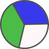
- I could create icons like this for the available color-combinations:
- Use the available Mapfeature with different colors inner circle for minimal beacon color, outer ring for maximal beacon color
- I could create icons like this for the available color-combinations:
-- Gaddhi (talk) 12:50, 28 February 2016 (UTC)
- Variants I would suggest, if my mentioned suggestions on the MapLocation Talk page are feasible:

- I like the pie-chart. It would be great if you can create .svg-images for this, .png would be ok, too. For the naming of the files I suggest piePGW.svg (pie followed by the first letters of the colors that are in the piechart). I'll add the support for custom icons for the map.
- @MillicentOak: Let's see how one big map looks, if it's too crowded we separate it for the regions. Good idea with the greyedout-beacons!--Cadaeib (talk) 14:07, 28 February 2016 (UTC)
- OK, I will create SVGs with pie charts for the different color combinations. -- Gaddhi (talk) 16:03, 28 February 2016 (UTC)
- Regarding the naming convention of the icons, I wonder if a different naming scheme would make more sense. The colors are ordered by level (White, Green, Blue, Purple, Yellow, Red) I believe it would be better to name the icons pieWB.svg to indicate a color range from white to blue. Does anybody know if this schema is sufficient to handle all beacons? -- Gaddhi (talk) 16:19, 28 February 2016 (UTC)
- I don't know if there are locations that leave out a color. To be on the save side I'd go with pieW.svg to pieWGBPYR.svg, so we can extend the files if we should need another pie (maybe for other things) or have pies with a different order of the colors.--Cadaeib (talk) 16:41, 28 February 2016 (UTC)
- I agree. Also, being a bit new to this I'm not sure how much data manipulation wikis make available - would it be possible to generate those charts automatically? And is it possible to store our data in some sort of simple database, or even a table? Could help keep it organised, and would also be good if the chart of all beacons could be updated automatically by drawing from that database.--MillicentOak (talk) 18:10, 28 February 2016 (UTC)
- I added all current locations with colors to the global map. I think it's much better now. Intersting how the colors are distributed, you did some great work by collecting them all so far! Some beacons are very accumulated, I guess these are duplicates in the list below. The small maps can be removed IMO, what do you guys think? Should there be a separation of the areas? I like one big map. The current one maybe even bigger.
- The template like it's now is pretty much the level of automation we can get. We could also use the SMW-extension that gives kind of a database-functionality, but that's better used for bigger datasets (like for the creatures on this wiki). For small table-rows with only coordinates, colors and maybe a note it's not very useful (an own page for each beacon had to be created, which would make changing of beacons a tedious task).--Cadaeib (talk) 02:36, 29 February 2016 (UTC)
- Nice, that looks really good! So will it update automatically then, when I do an edit source on either the whole page or an individual region? Haven't played with templates before, sorry! And, afaik, there are no duplicate beacons, some of them really are that close together - e.g. at the southern tip of Footpaw, there's one that can appear on the beach, and one can appear on the cliff above it. Similarly, Smuggler's Pass has a whole bunch of different locations which are either at the tops of cliffs, or in the bottom of the pass. I'm sure we've still got plenty of beacons to go, I think the rest of the map may end up a little more crowded too! That's why I wondered whether regional maps might be a good idea - that way you get a better idea of where the beacons actually are.--MillicentOak (talk) 09:56, 29 February 2016 (UTC)
- @MillicentOak: Currently the data is duplicated: One dataset for the global map and another dataset where each beaconlocation is in a separate map - so editing the single entries will not have an effect on the global map. We should take care that we do not lose some of the gathered data. I agree that there are still a lot of beacons missing, but I believe that some of the densest regions are already mapped, so I think that it should be ok to use a single map.
- I just played around with different map and marker sizes: My personal preference would be a mapsize of 800px and markersize of 18. However I understand that users with a smaller display should also have a pleasant experience on this page.
- With the big map now available I think that the single-location maps can be removed.
- @Cadaeib: Wow ... I wanted to create the pie charts today, but you were way faster. The tabular data representation for the beacons looks good from my side. Thank you for all that! I just looked at the map, and found a few points of discussion however.
- The location of regular circular markers seems to be bugged: Have a look at the map a few comments above. The markers should be concentric (yesterday they were concentric), but are anchored on their top left corner. In a related issue a regular circular marker set to the same coordinates as a pie chart results in them being not concentric.
- The Beacon locations are shifted to the right (and possibly a bit down). For example the white becon at "78.3,79.6" is not in the water as shown on the map. In order to calibrate the coordinate system I could gather some exact GPS coordinates of distinctive map features.
- Would you be ok if I tried to change the opacity of the pie charts so that the map features shine through the pie chart icons?
- -- Gaddhi (talk) 11:44, 29 February 2016 (UTC)
- Sounds like 1 and 2 are the same issue. Fix 1, possibly with an offset, and hopefully 2 is sorted. Unless I'm missing something? Just had a look at 800px and 18, looks good to me, including on my 1280x1024 second monitor. I'd even be happy with marker size of 15, but then I do sit quite close to a big main screen. I'm all for removing all the smaller maps, they make the page far too long. I think that removing them shouldn't be done until we've decided on how to store the data though, since that image is where we're currently storing the coordinates! Looking forward to getting rid of some redundant "The beacon here can be"s too :P --MillicentOak (talk) 13:43, 29 February 2016 (UTC)
- Yes, there is an offset-problem, I couldn't solve yesterday. Once fixed, issue 1. and 2. should be resolved. The data of the small maps is completely redundant for now, all information is in the big map, so I will remove the small maps. We can decide later if we want to make separate maps for some regions. I changed the mapsize to your suggested 800px, markersize of 18 and opacity of 0.8. Looks good for me.--Cadaeib (talk) 14:29, 29 February 2016 (UTC)
- I had a different idea for a graphical representation of inaccessible beacons and implemented it for testing on the map. If you think that we should use greyed-out colors, feel free to revert my edit.
- @Cadaeib: Thanks for the explanation of the offset-problem. -- Gaddhi (talk) 12:25, 1 March 2016 (UTC)
- Good idea. It seems there is still an offset problem. Also for the calibration of the map, if you happen to think of a good method to determine the coordinates of the borders of the image, we could adjust that. The beacons on the east-side seem to be too far to the east.--Cadaeib (talk) 12:53, 1 March 2016 (UTC)
- Yes, it looks like the problem gets worse the higher the longitude reading, as if the width of the map were wrong (either image or coordinate system).--MillicentOak (talk) 16:04, 1 March 2016 (UTC)
- Yes, that was it. There is a mistake in the MapLocations template - the default values for borderCoordX are wrong. I've overridden them here because I don't know how to fix the defaults.--MillicentOak (talk) 17:01, 1 March 2016 (UTC)
- Yes, it looks like the problem gets worse the higher the longitude reading, as if the width of the map were wrong (either image or coordinate system).--MillicentOak (talk) 16:04, 1 March 2016 (UTC)
Marker
I changed the icons of the beacons. The colors of the represented beacons have their fixed position in the icon now, making it easier to distinguish, at least that's the idea. I think the overall icon is too small now in most cases. What do you think? Maybe increase the red-dot in the middle. Or underlay a circle the size of the whole icon? Or switch back to the previous icons?--Cadaeib (talk) 21:32, 3 March 2016 (UTC)
- I really like the style of them, but find them hard to read on my second monitor which is quite small (which is where I normally leave the map, at least whilst I'm gathering beacon data). If anything it's the orange dot that needs to be smaller and the segments bigger, because to me they're more important - I imagine I'm not the only one who wants to know were to go beacon hunting. The beacons in game really stand out and the colours really pop out at you - if only there were some way to do this on a map. --MillicentOak (talk) 22:49, 3 March 2016 (UTC)
- Reverted it back, it's just too hard to see now. Good suggestion to enlarge the orange center. I looked at it with an opacity of 1, that looked better. You can have a look at this setting when going to the version with the rings in the history, edit this, change opacity to 1 and click on preview. I'll have a look next week at this again, enlarging the center-marker etc.--Cadaeib (talk) 01:08, 4 March 2016 (UTC)
- Thanks for trying out a new design, however I don't find it pleasing. I tried larger sizes, but have the implression that the pie chart conveys the information more clearly.
- The issue that the colours don't pop out is something that I would also like to change. It might be solved by desaturating or darkening the map itself, so that the beacon icons have a higher contrast to the map. I tried to recreate the map from the Dev-Kit by using the instructions found on The Island Map; however I only managed to export the height map, but did not find a way to export the surface colours by using masks. @Cadaeib: Since I am new to the devkit and you apparently created that map in the first place, could you please point me to a tutorial how to do such a thing? I found no solution in the documentation and only a tutorial of that task behind a paywall. -- Gaddhi (talk) 09:54, 4 March 2016 (UTC)
- Sorry, I meant make the orange centre smaller! The main benefit to this design over the pie charts that I can see is that it still conveys information if you're colourblind because the location of each colour remains the same. Perhaps it would be possibly to make it more pie-y to emphasise the active colours? Kinda like a Trivial Pursuit playing piece? On the topic of the map, is it possible for the map to display the ice floes that are in the North West? I haven't used the dev kit at all yet, so don't know much about what's available.--MillicentOak (talk) 10:40, 4 March 2016 (UTC)
- I'll change the opacity to 100%, the 80% don't improve the visibility of the underlying terrain anyway, that should make the marker more clear.
- @Gaddhi: The layers are only greyscale-images, you have to add the color as you please. For a tutorial I recommend the cartographers guild, the guys know what they do. E.g. have a look at this nice tutorial.
- @MillicentOak: I'll give the markers another try, good suggestions. Regarding the icebergs, they are not in the layers in the devkit, they have to be added manually AFAIK. I'll have a look next week if Gaddhi doesn't beat me there ;)--Cadaeib (talk) 12:19, 4 March 2016 (UTC)
- Presenting the info fitting for colorblind people sounds like a good idea. For testing and discussion I just made another layout: User:Gaddhi/BeaconLocations.
- Adding the icebergs sounds like a good idea. But since I just started using the dev-kit, I am struggling with how to accomplish things. Thanks for the cartographers link looks good, but I have problems at a much earlier stage: namely to export the greyscale-images of the different layers. In landscape mode I can only export the heightmap, but I fail to see how to access the different layers.-- Gaddhi (talk) 13:38, 4 March 2016 (UTC)
Dev-Kit Data
Thank you for your work with the Dev-Kit and extracting the data. However it seems like there is a mismatch between the dev-kit data and the in-game beacon locations and colors, that I have experienced. I am wondering if the reason for this is the fact that I am currently on a server with a Max 30-Dinovevel, or if there is something else we are missing. -- Gaddhi (talk) 12:31, 15 March 2016 (UTC)
I saw some mismatches between the data, too. But I think to use the devkit-data as a new base is better than the manual data. The old data is not lost, so you can always get it from the history. Can you name some specific beacons that you noticed to be wrong? I don't think the max-dinolevel influences the beacons.--Cadaeib (talk) 14:08, 15 March 2016 (UTC)
- At the moment I can recall the following examples for mismatched colors: 76.9/79.6 and 18.1/16.7 and 28.9/49.7 and 78.7/36.9. The beacons in the vicinity of 60/35 are now missing completely. Nearly all of the edits that I have made on this page, I can back up by in-game screenshots. I also think, that the max-dinolevel does not influence the beacons - so there is still something else going on here.
- Currently we have the following combinations and I added my suggestion how to deal with them:
- Manual beacon that gets confirmed or extended by devkit data: use devkit data (this seems to be the majority of all cases)
- Manual beacon with mismatched colors from the devkit: use manual data
- Manual beacon and no devkit beacon: use manual data
- No manual beacon but devkit beacon: use devkit data but make a note that this beacon is not yet confirmed in-game
- If you agree, then I will merge the two datasets by this method. -- Gaddhi (talk) 14:50, 15 March 2016 (UTC)
- Hi, good suggestions! I added all the devkit-data so it is at least available here. The devkit-data also contained the probability/weighting-factor for the colors of each beacon. But currently it's of no real use to add this information I guess.--Cadaeib (talk) 15:16, 15 March 2016 (UTC)
- Hiya, late to the party :P
- Yeah, I also have screenshots of beacons which don't match up with the devkit data - perhaps the devkit ones are out of date? Probabilities could be cool within the pie chart format, but unless we have a way of automating the image creation, not worth the hassle imho - would also leave the question of what to do with the beacons missing from the devkit.
- Additional: At a first glance through my screenshots folder, there are at least a dozen beacons missing from the new map, and several which are the wrong colour. Although the new data confirms a beacon I suspected existed from seeing it at a distance, but never reached in time to record its coordinates, I'm concerned that if there are missing and incorrect beacons, there may also be extra beacons which don't exist in the game. If so, how are we going to correct them? It'd take a very long time in-game to even spot which ones might be wrong, let alone prove they don't exist. Likewise for colours - we can currently confirm that there's a new colour to be added to a beacon. But how do we know the colours being added in this dataset are correct?--MillicentOak (talk) 17:04, 15 March 2016 (UTC)
- Okay, here's a list of what I've found in my screenshots so far:
- Missing: 54.4,36.1; 56.8,27.1; 57.5,22.8; 59.4,32.8; 60.7,38.8; 61.7,35.6; 62.7,31.8; 64.2,17.4; 67.8,21.9; 70.8,21.7; 72.7,38.9; 74.8,19.4
- Wrong colour: 18.0,16.7; 28.8,49.7; 29.3,53.4; 55.5,23.7; 61.9,20.3; 73.6,22.9; 78.7,36.8; 82.3,20.6
- http://imgur.com/a/Rj98q --MillicentOak (talk) 21:34, 15 March 2016 (UTC)
- If the map shows more colors / beacons than are in the actual game, there's hardly a way to proof they are not there. It could always be that we just didn't see that beacon / color. The other way around is simple, we just can add the missing values. I'm wondering though, that there are these mismatches, the devkit is v236.2, the data should be pretty uptodate. But as mentioned earlier, I just added the devkit-data so it's available. Feel free to revert/remove/add beacons that you find different in the game. Gaddhi's suggestion how to merge the datasets sounds like a good method, we should do it like this.--Cadaeib (talk) 22:50, 15 March 2016 (UTC)
- I rechecked the extracted data, and it seems the beacons are named in different ways in the devkit, causing some beacons to get lost during my extraction-process. I'll redo the extraction to catch all of them.--Cadaeib (talk) 23:18, 15 March 2016 (UTC)
- Sounds good. Then I will merge the datasets after you have redone the extraction. In the meantime it is probably best to not edit the current data, so that these changes do not get lost in the process. -- Gaddhi (talk) 10:16, 16 March 2016 (UTC)
- Sounds good to me! --MillicentOak (talk) 12:05, 16 March 2016 (UTC)
- Ok, after some trouble the map now should reflect the devkit-data. Remarkable are the amount of possible high-level drops in the northern areas. I checked the weighting factors, and red beacons mostly have only a ~1% chance to appear, so barely anyone will see them if not living near a drop. Currently the map looks like a lot of red drops can be found nearly everywhere, which is not reflecting reality, so we should add somehow a rarity to the icons. As you mentioned, the icons cannot be created automatically that easy, only css is possible. Or... maybe javascript could be used to create the .svg-files. I'll look into the possibilities there. Do you have any cool ideas how to visualize the rarity or other ways how to improve the map?--Cadaeib (talk) 18:23, 16 March 2016 (UTC)
- Your new extracted data looks good - I just finished merging the two datasets and only found two problem cases:
- 30.3,31.3: possibly typo; @MillicentOak: perhaps you can shed some light on that http://ark.wiki.gg/wiki/index.php?title=Beacon_Locations&diff=101198&oldid=101196
- 52.3,78.5: (Screenshot of the Beacon. @Cadaeib: Is it possible that there is still a problem in your extraction script?)
- -- Gaddhi (talk) 23:01, 16 March 2016 (UTC)
- Your new extracted data looks good - I just finished merging the two datasets and only found two problem cases:
- Perfect, thanks for the merging! I rechecked the 52.3,78.5 manually, the devkit definitively only says WGB. Could it be it's a white beacon on the screenshot as they show rainbow-colors sometimes? If not, there's a mismatch. I'll hang around there ingame for a while with slomo 100.--Cadaeib (talk) 23:27, 16 March 2016 (UTC)
- Thanks, now that I looked again, it might be that I misinterpreted my screenshot. This scenario seems to be more likely, than a mismatch. So I will change the beacon to the devkit data, but keep an eye on that location. -- Gaddhi (talk) 10:01, 17 March 2016 (UTC)
- Yes it was a typo! Dangit! 30.3,41.3 confirmed. Nice work :D Also, thanks for the link to the edit, made it much easier to find the relevant screenshot http://imgur.com/UohKpX2 ! --MillicentOak (talk) 16:25, 17 March 2016 (UTC)